-
A selection of drawings from the Scrap Art Project (SAP) series first developed for The Brooklyn Art Library collection with a series of Christmas greeting designs in the background.
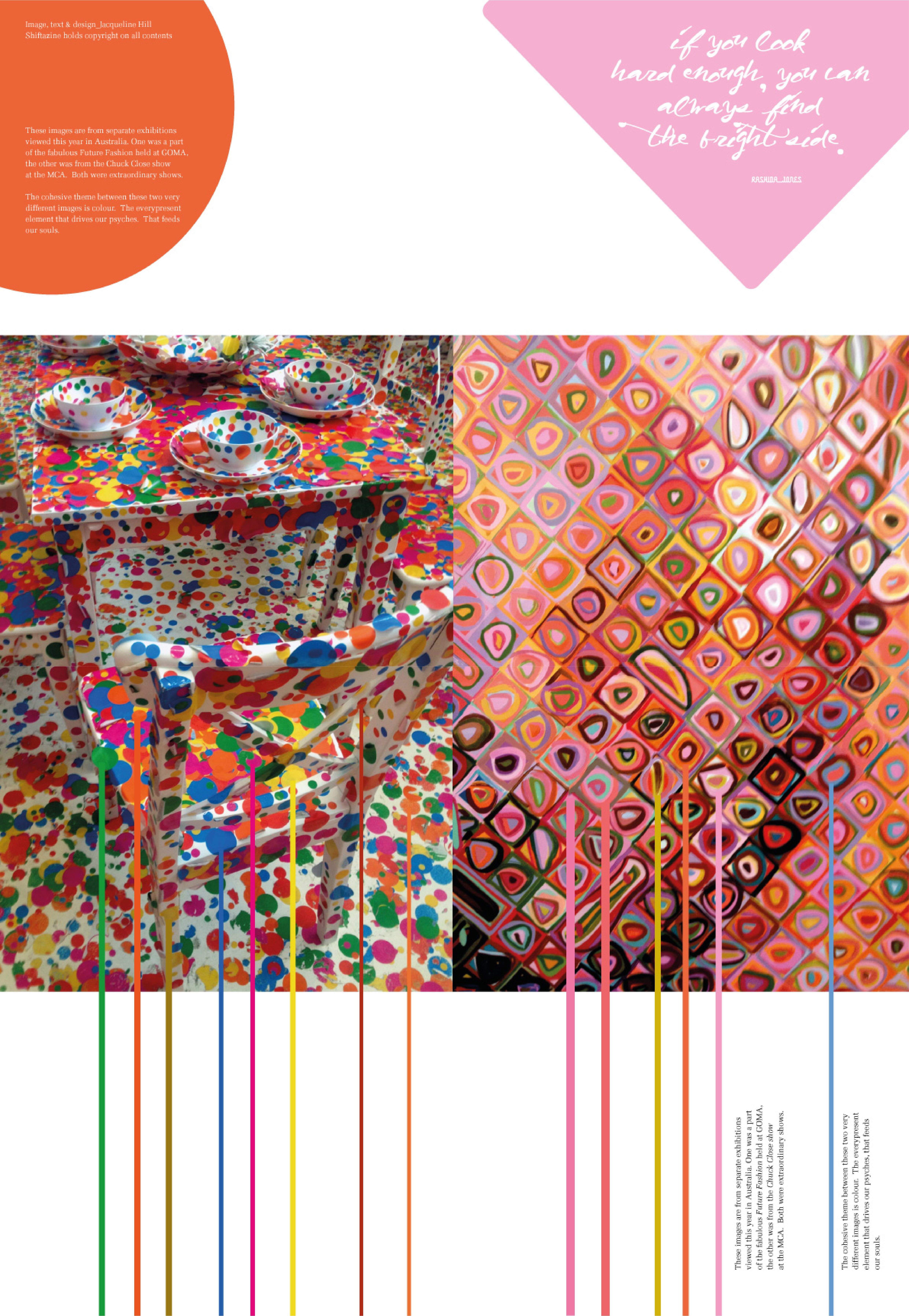
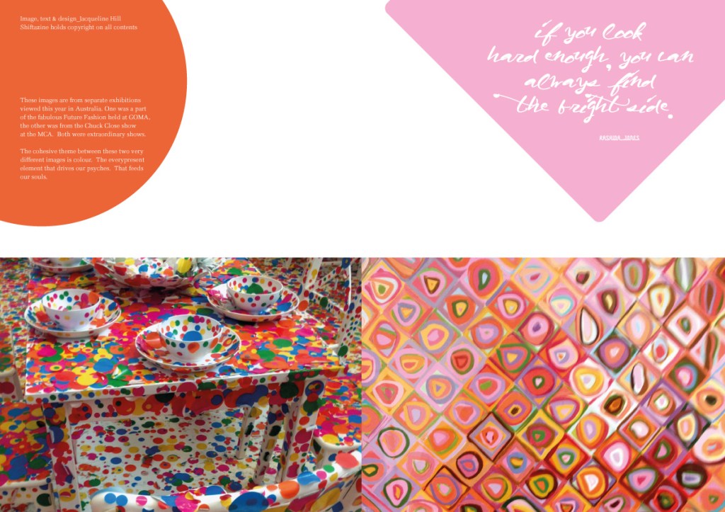
A celebratory poster and two double page spreads for Shiftazine, featuring content from exhibitions presented by MCA Sydney and GOMA Brisbane.

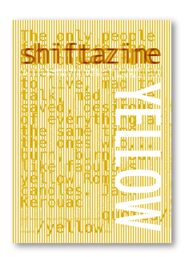
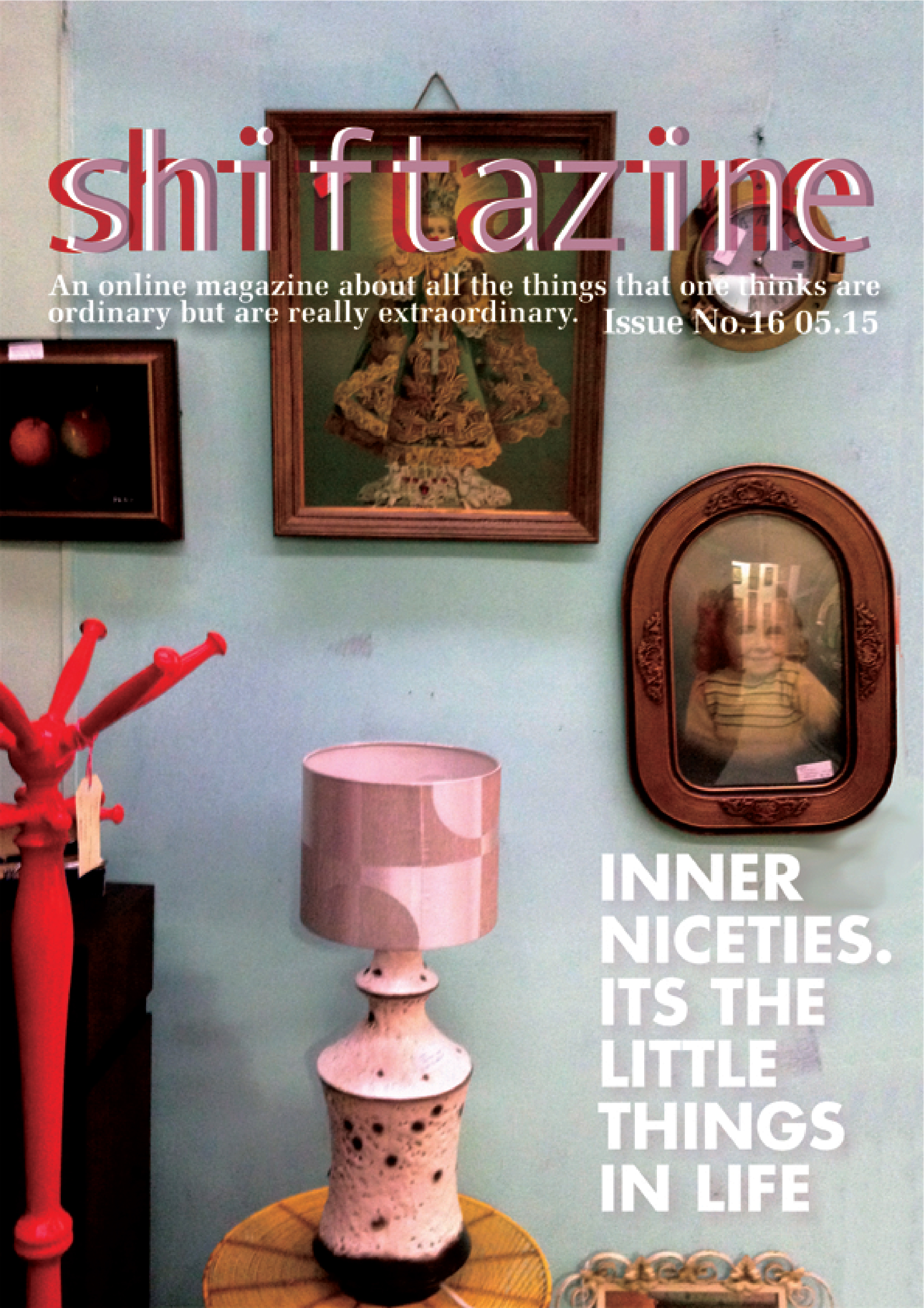
The cover for Shiftazine‘s Issue No.16 ‘The Yellow Issue’
1. A Silk Scarf design based on the FORMA typeface representing and re-enforcing the Iranian women’s resistance chant of “LIFE, WOMEN, FREEDOM.“


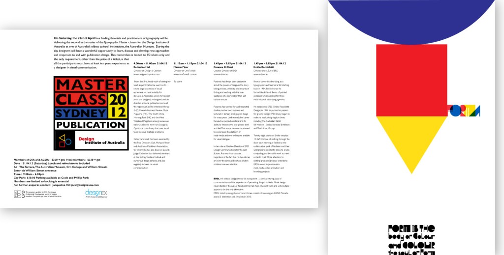
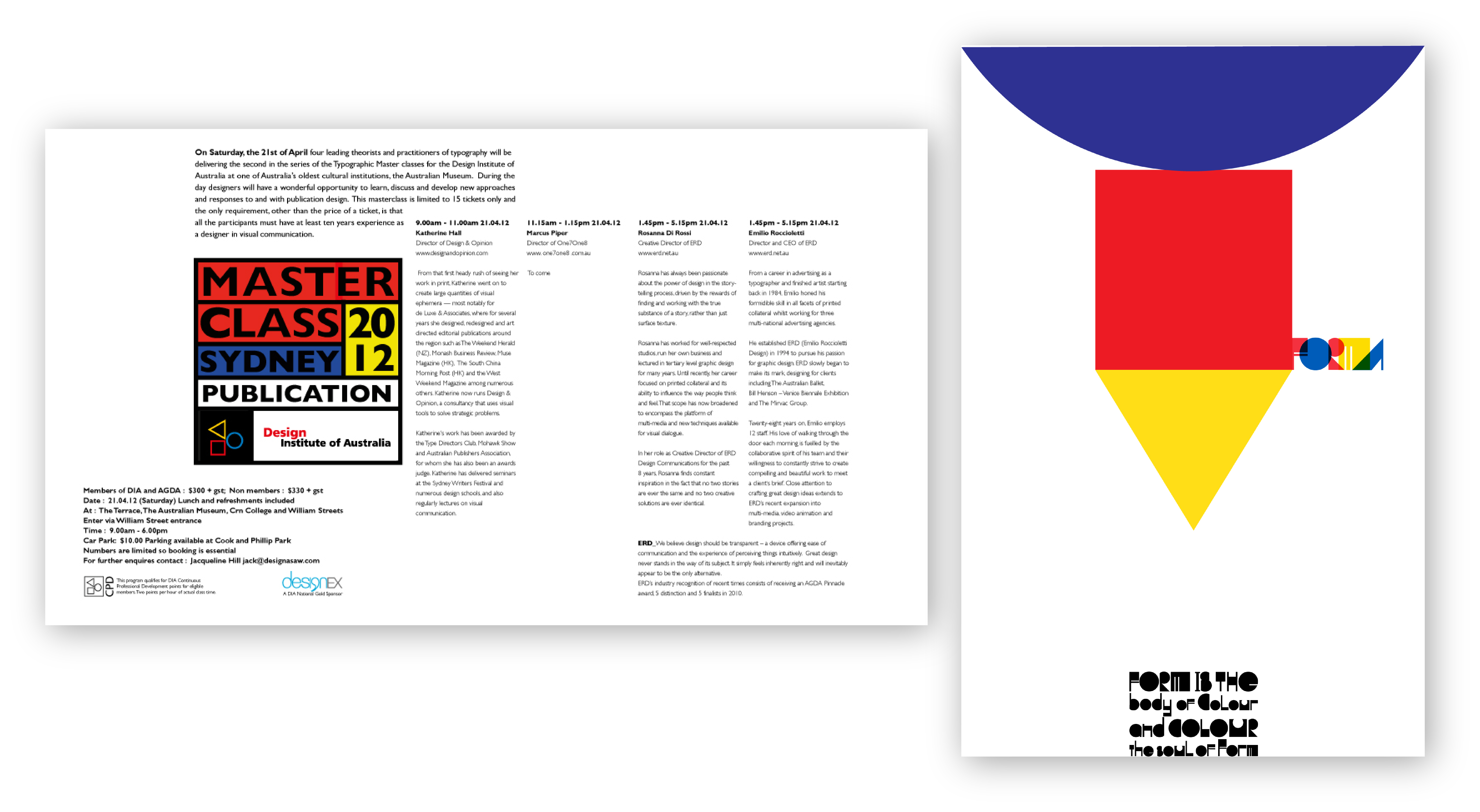
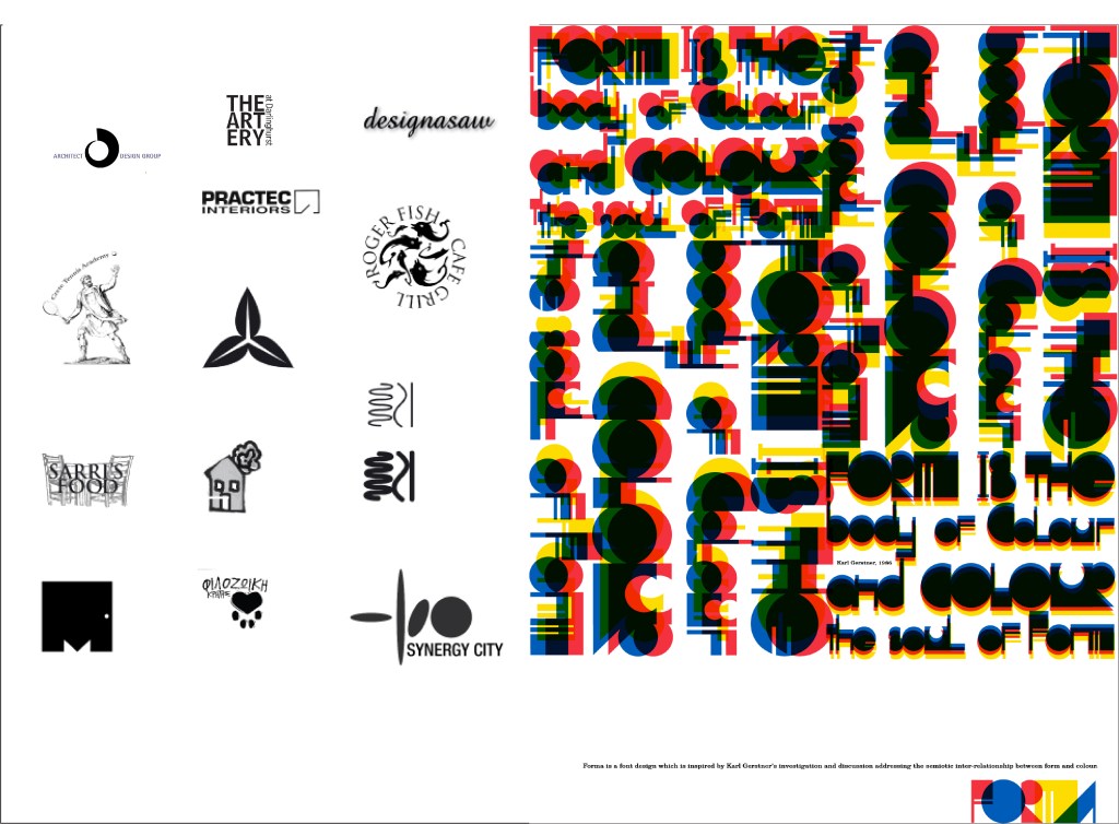
1. Design and delivery of the Master Class series for the Design Institute of Australia. Print and online material. 2. Poster design to promote the new type face FORMA
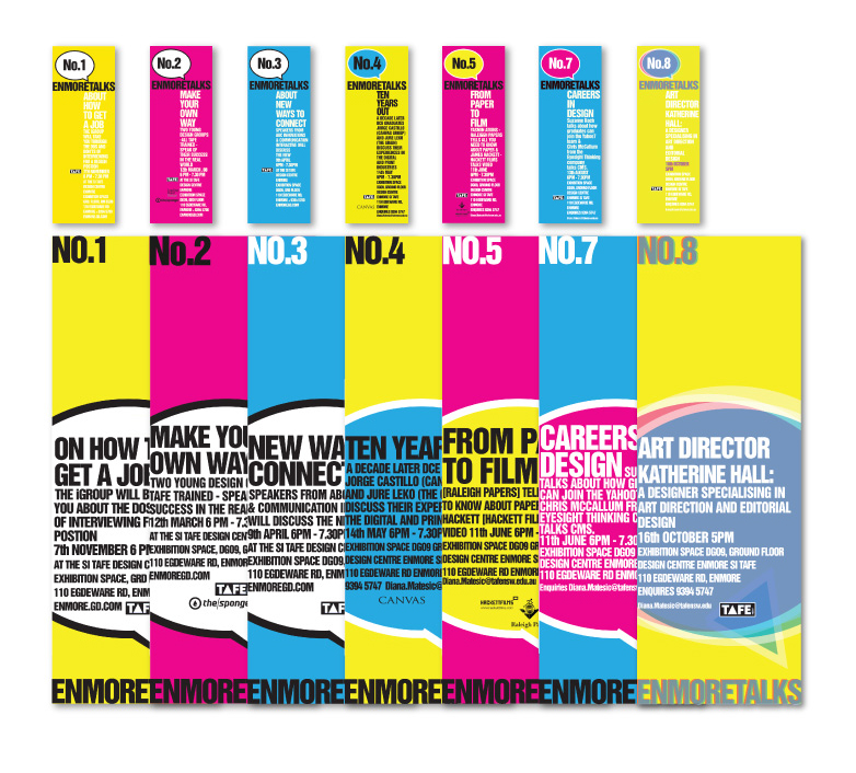
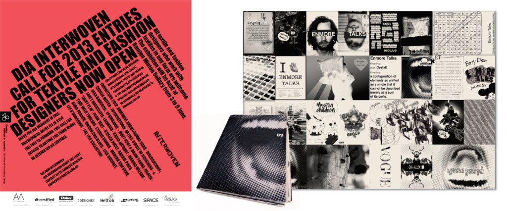
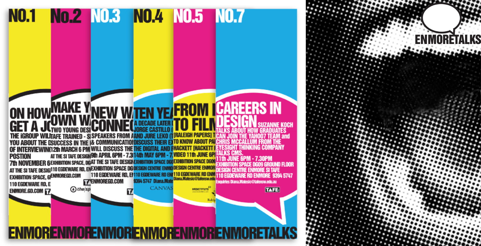
A Zine created and printed on newsprint, for the promotion of an industry talks series for Enmore Design Center (EDC).

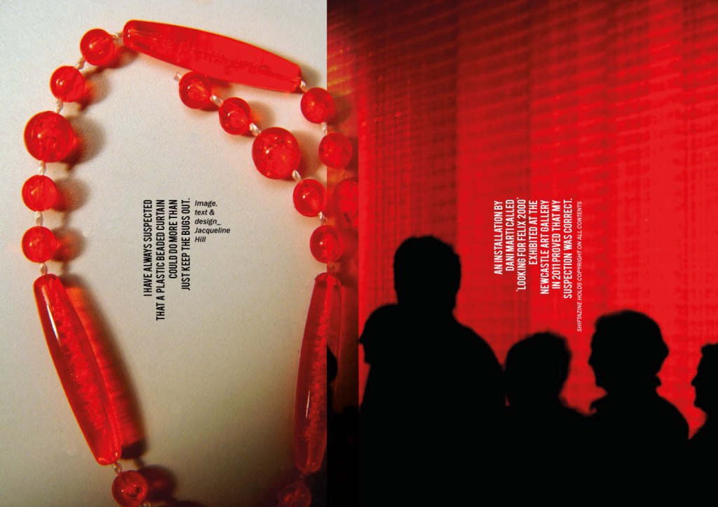
Celebration of an innovative installation at Newcastle Art Gallery of Dani Martini’s ‘Red Beads’ with a DPS article for publication.
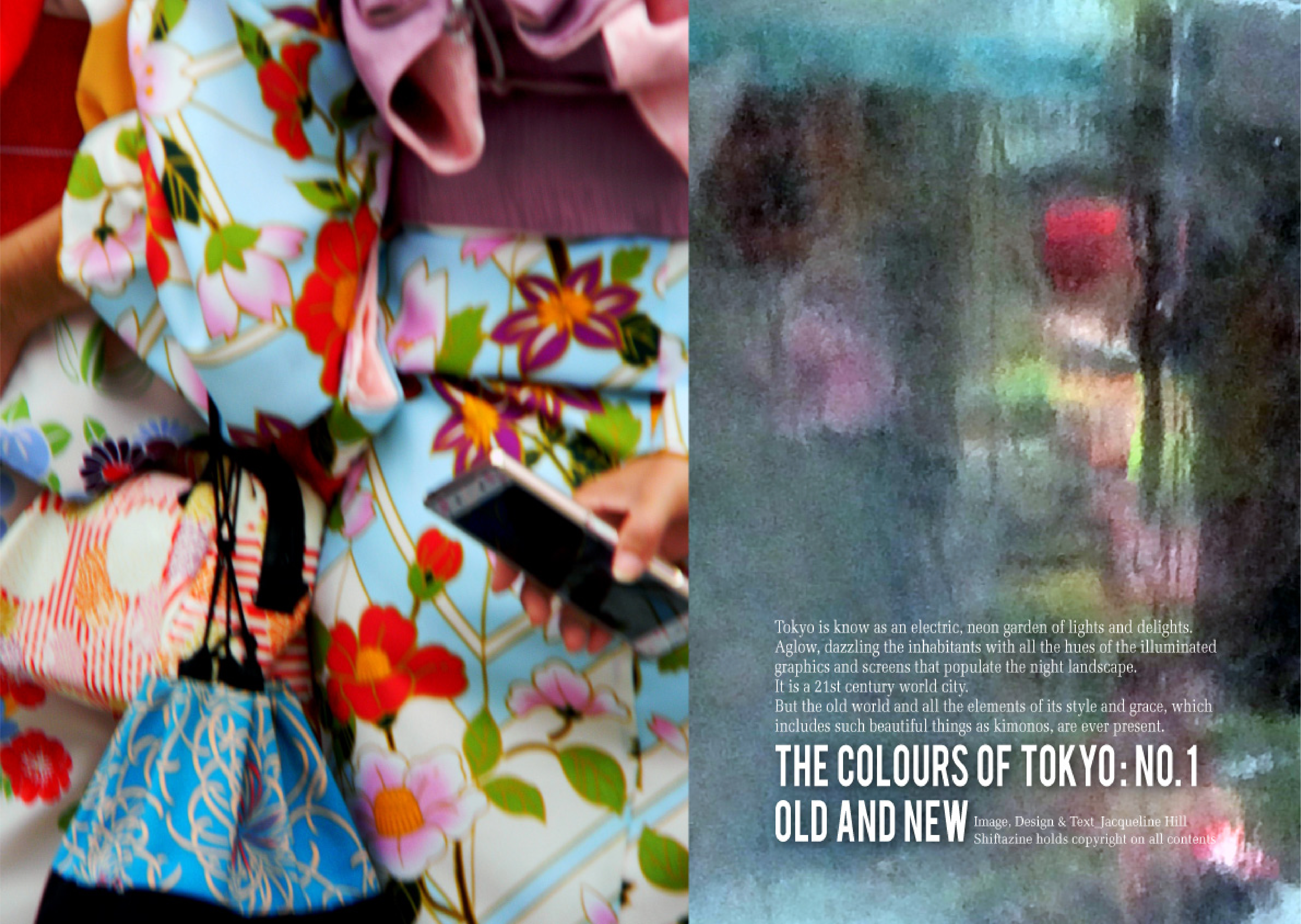
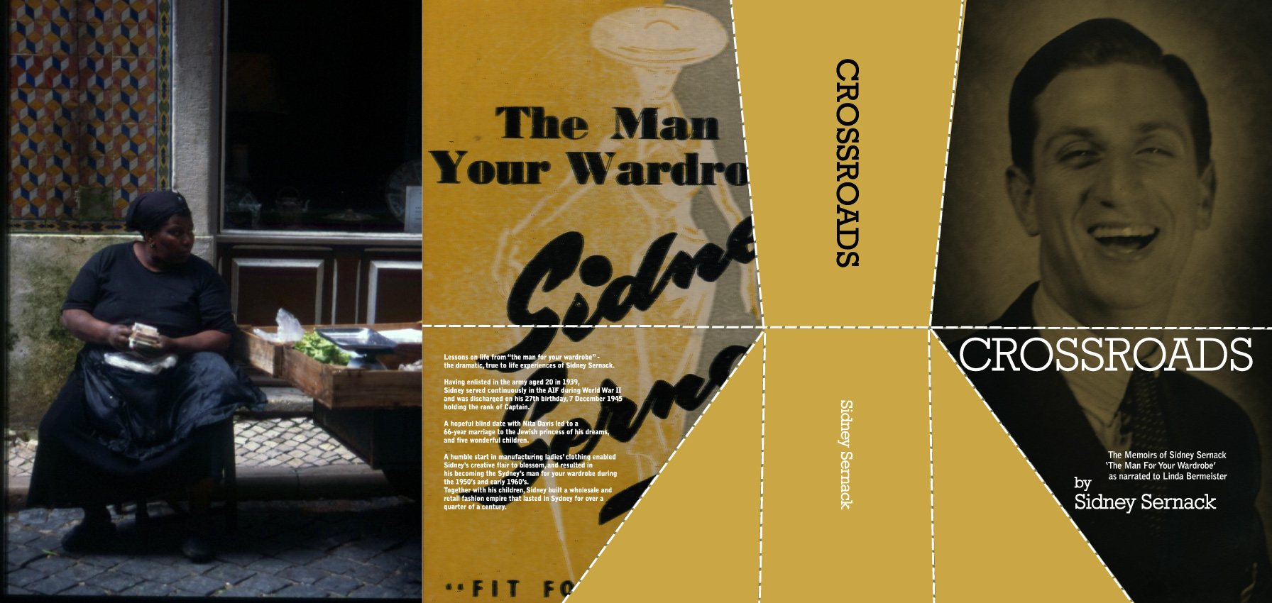
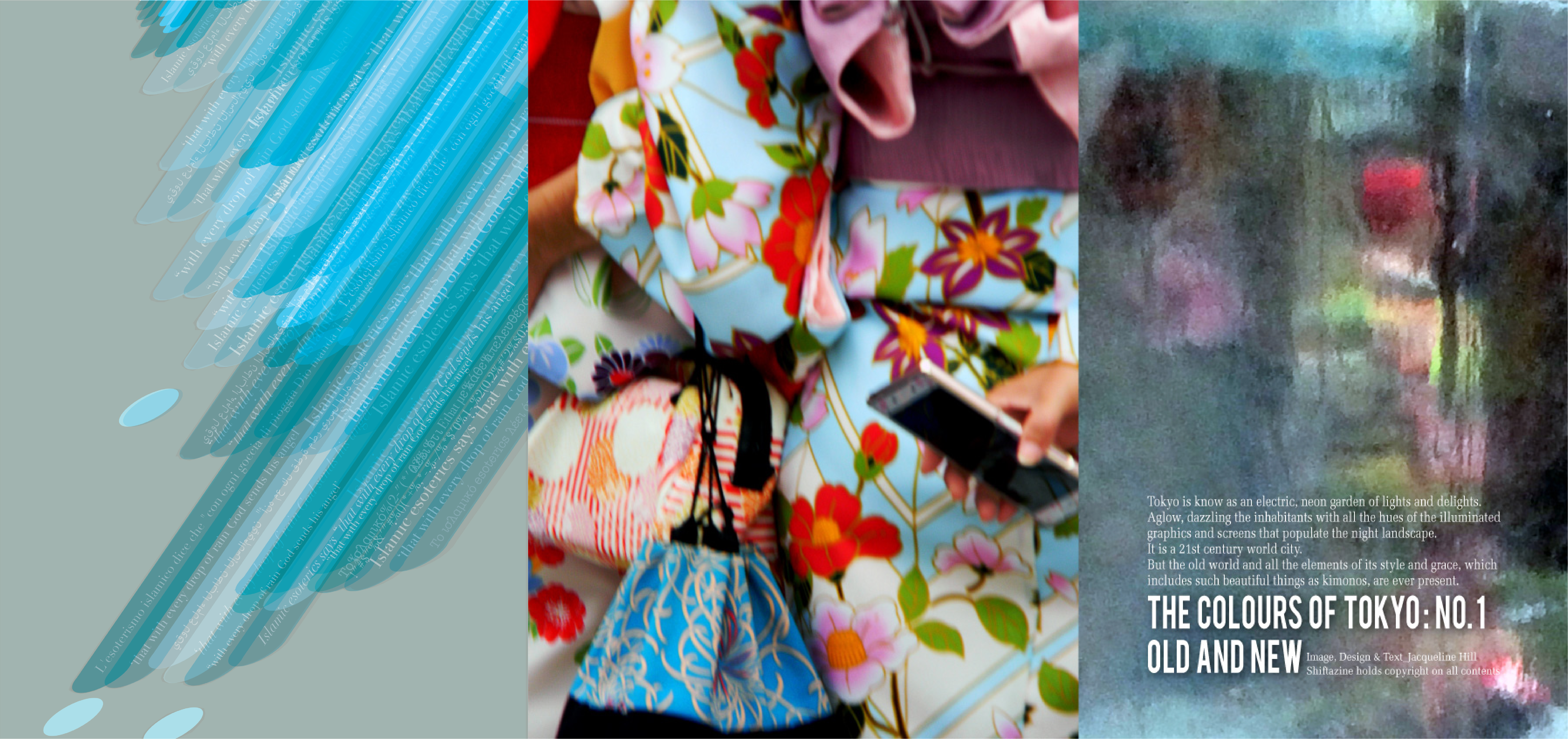
1 Double page spread from the ‘Tokyo Issue’ for Shiftazine 2 Personal photography: Portrait of street vendor in Lisbon Portugal .3 Cover design for biographical publication entitled Crossroads.
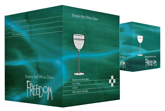
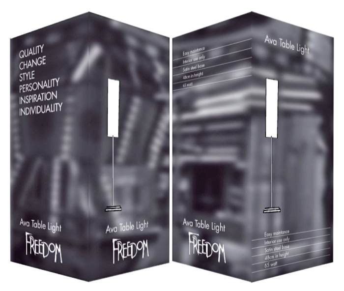
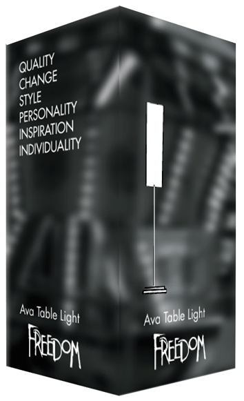
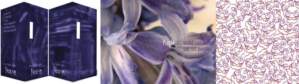
A new approach for the visual language of Freedom Furniture .
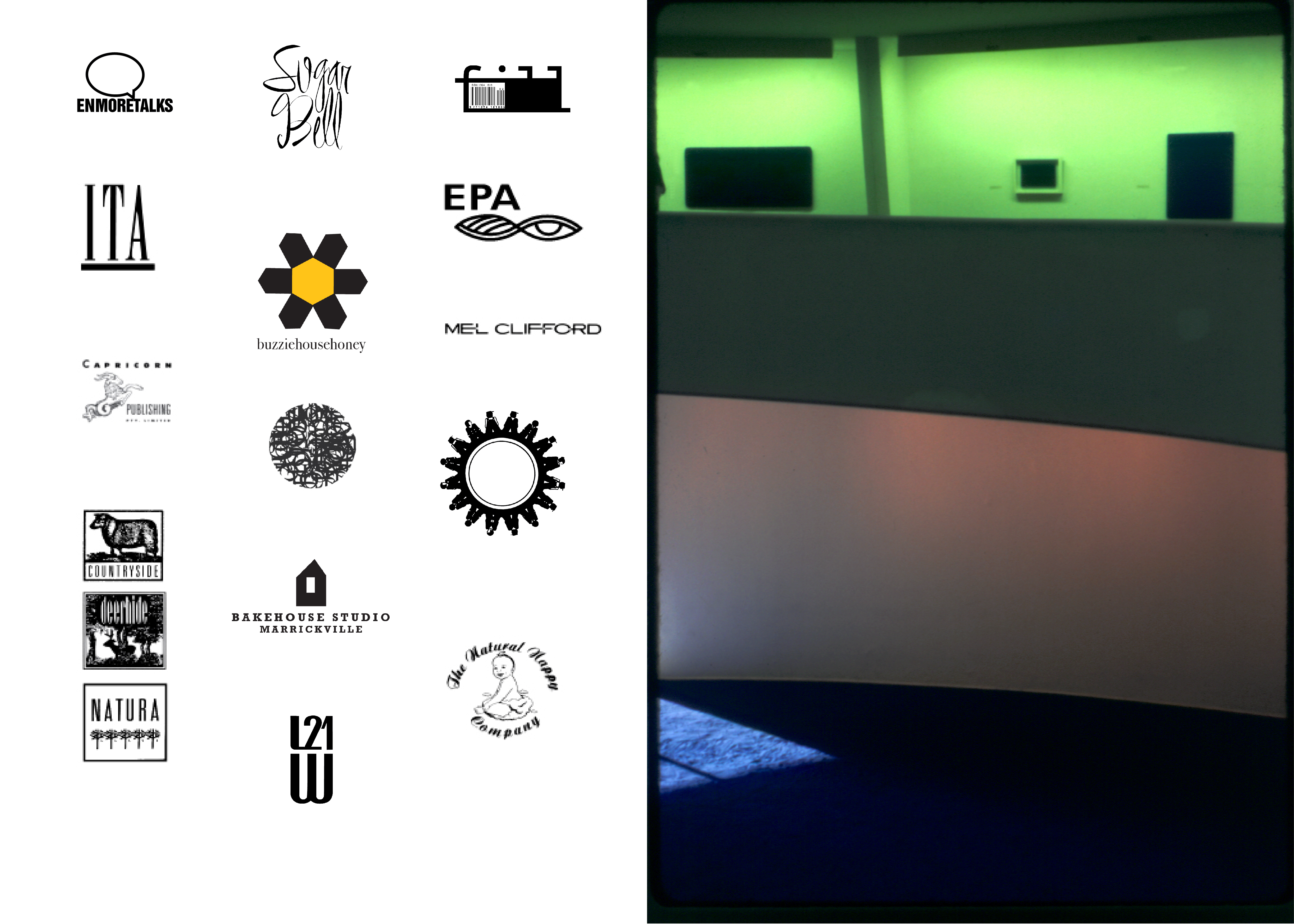


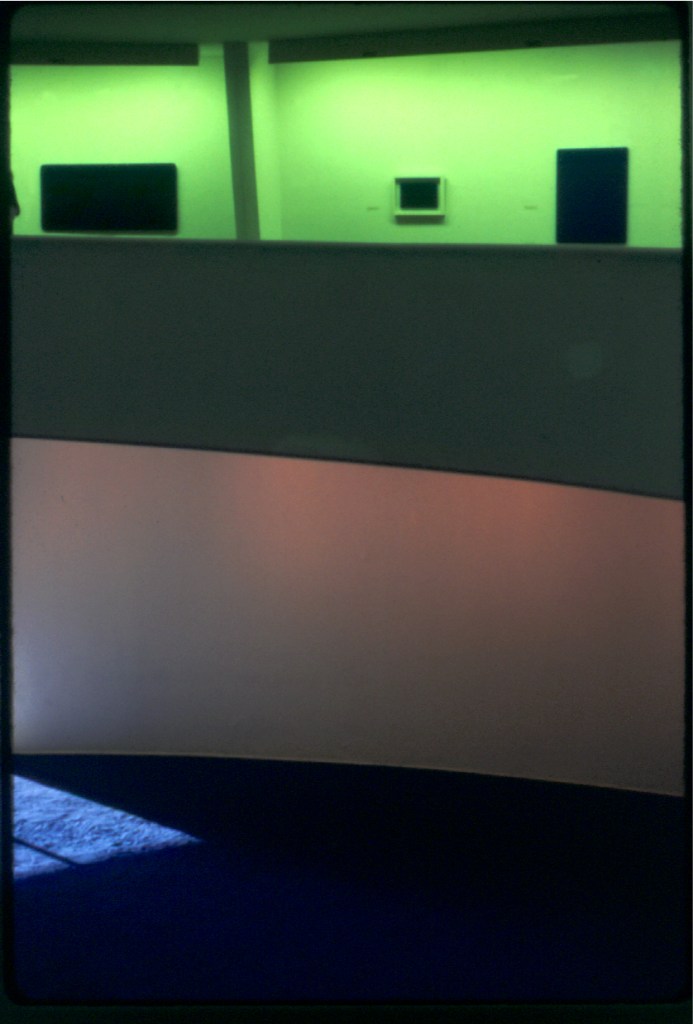
1. A selection of Visual Identity Marks (VIM). Enmore Talks EDC; Sugar Bell Pastries; ‘fill ‘the zine; ITA Buttrose flag ship magazine; BuzzieHouse Honey; EPA Environmental Protection Authority Australia; Workcover Authority; BakeHouse Studio Ceramics; 2. A trip to New York, a visit to the Guggenheim Museum, an observation of colour and shape..
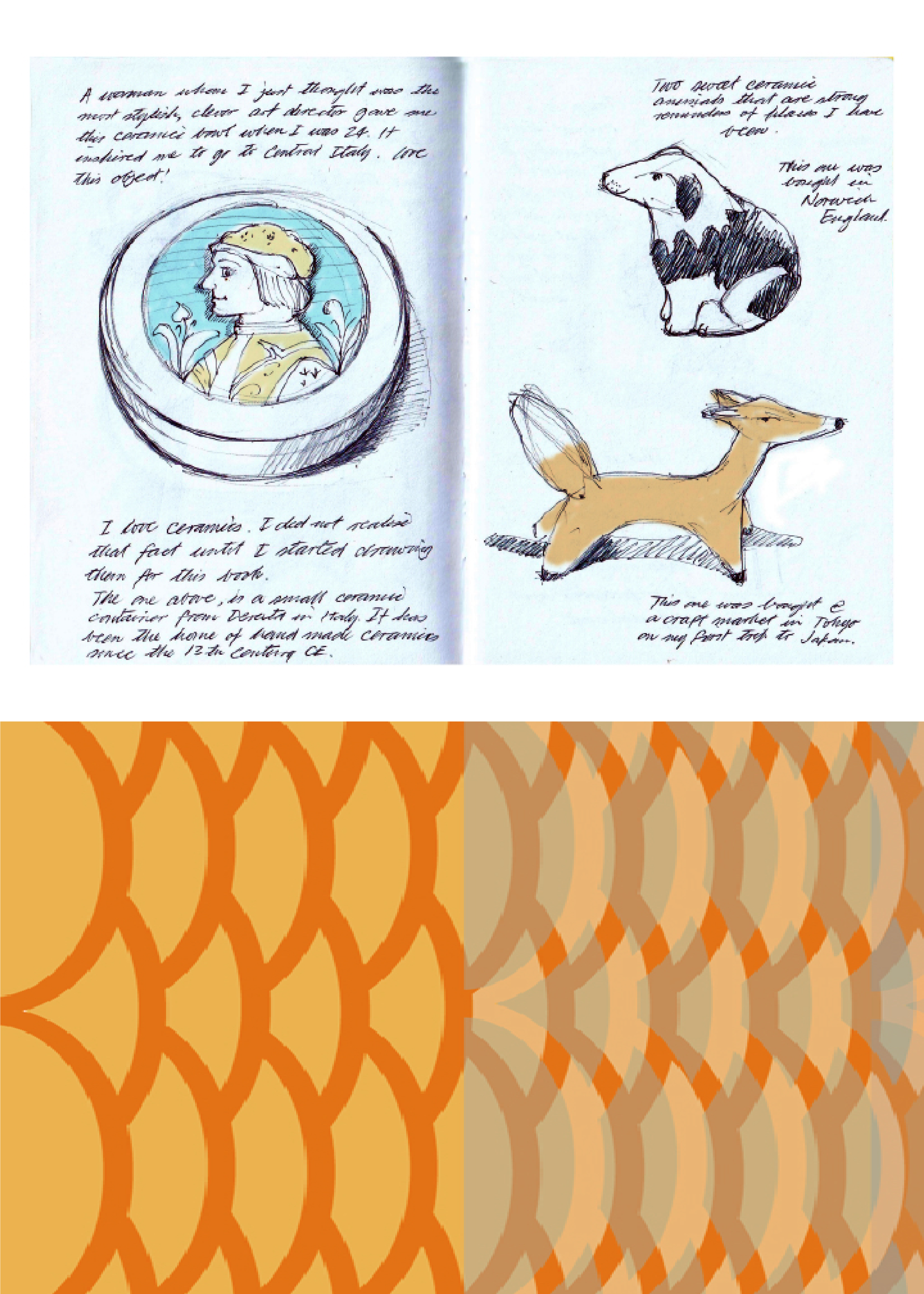
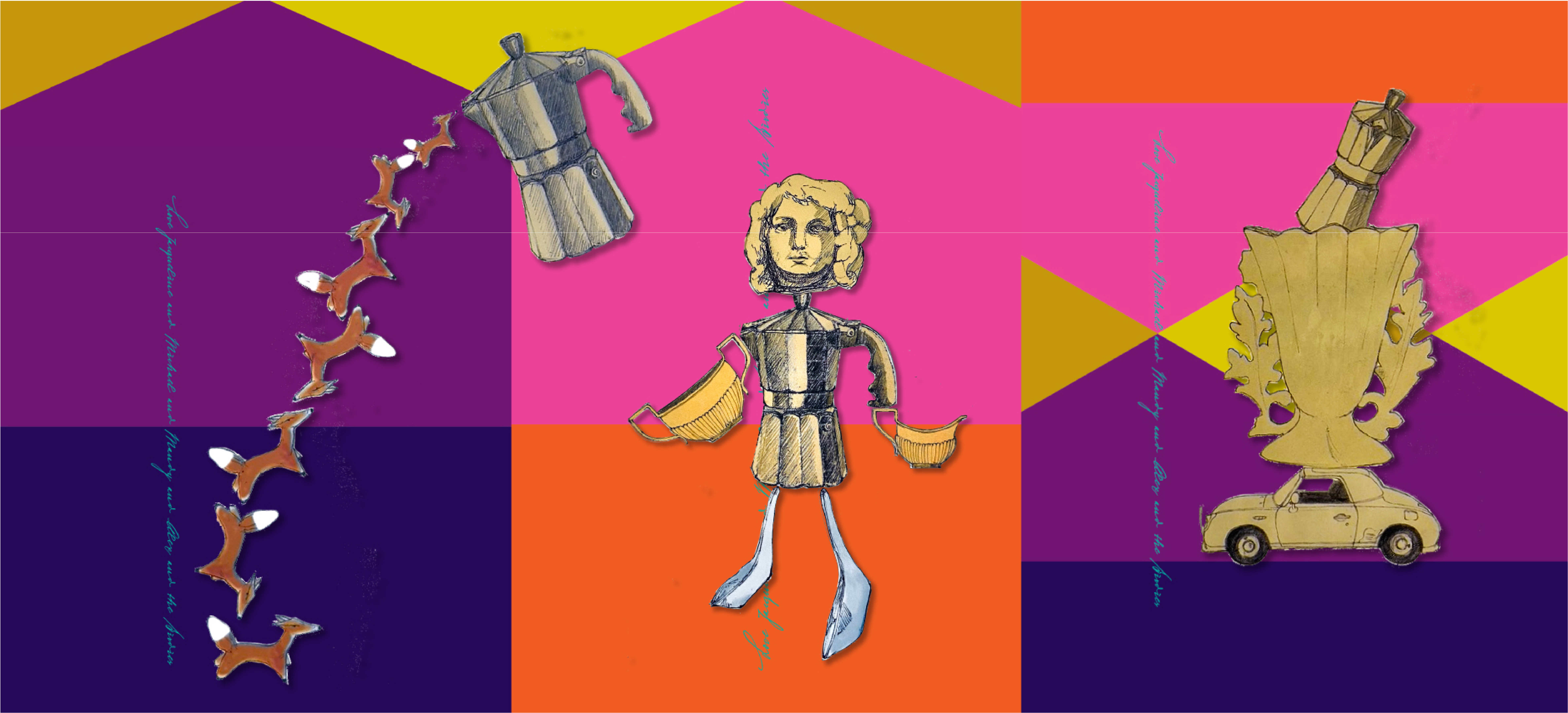
1.One of the spreads within my sketch book entitled ‘Things That I love’ for The Sketchbook Project. Brooklyn Art Library. 2. Panel design for The Artery Gallery corporate identity program.
Typographic self portrait for DCE Australia.
1. Another spreads within my sketch book entitled ‘Things That I love’ for The Sketchbook Project. Brooklyn Art Library.. This spread features glimpses of my dear Positano.
2. Double Page Spread for the publication ‘Numinosity. What gives Visual Identity Marks their sway’. 3. Cover design for the publication ‘Numinosity. What gives Visual Identity Marks their sway’.
2. A typographic self portrait fo
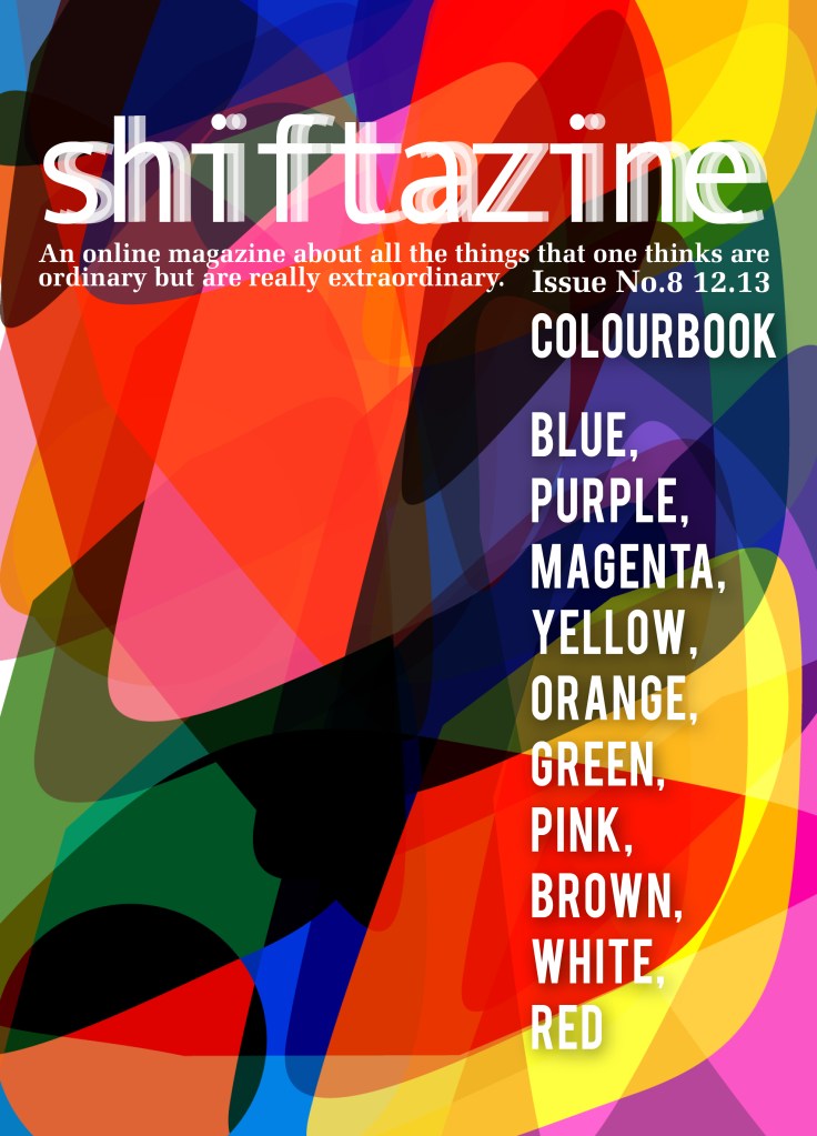
1. A poster for call for environmental awareness and climate change. 2. Shiftazine DPS for article featuring Tokyo‘s vintage fashion scene. 2. Covers for Shiftazine Issues: ‘Inner Niceties’ Issue No.16 and ‘ColourBooks’ Issue No.8.

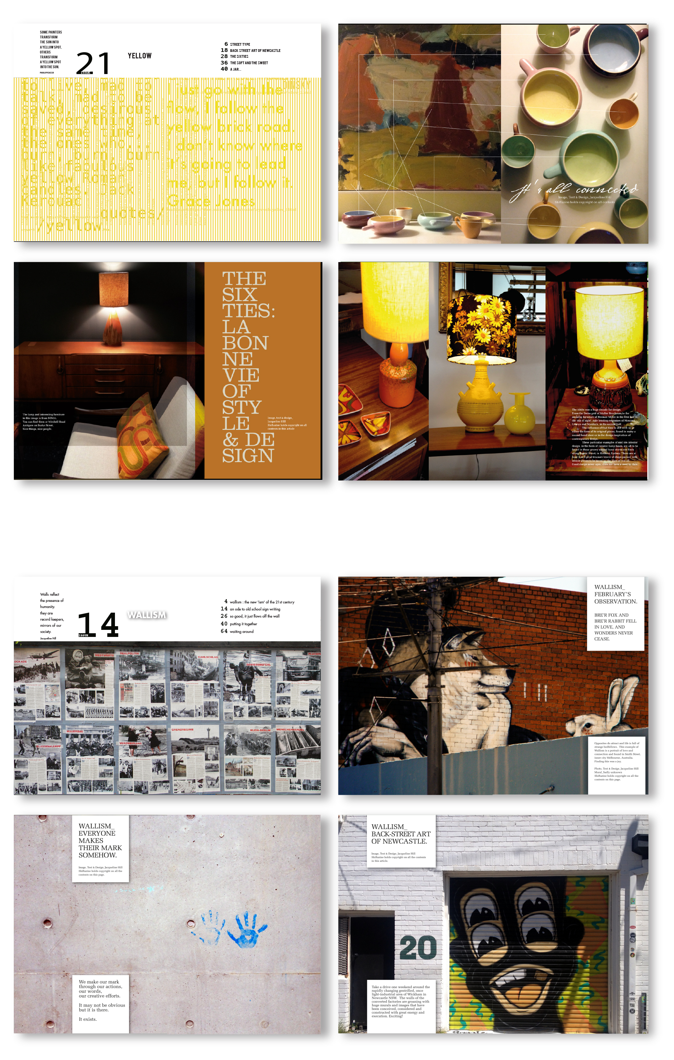
1. Two groupings of articles from two issues of Shiftazine. ‘The Yellow Issue’ Issue No.21 and “Wallisms’ Issue No.14. 2. Package design for Royal Copenhagen Ice Cream. A new idea for RC Ice Cream to extended their market share by creating and offering of a ‘take home’ pack
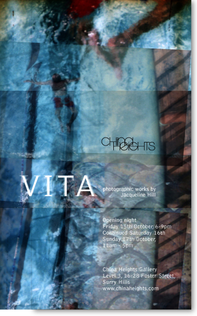
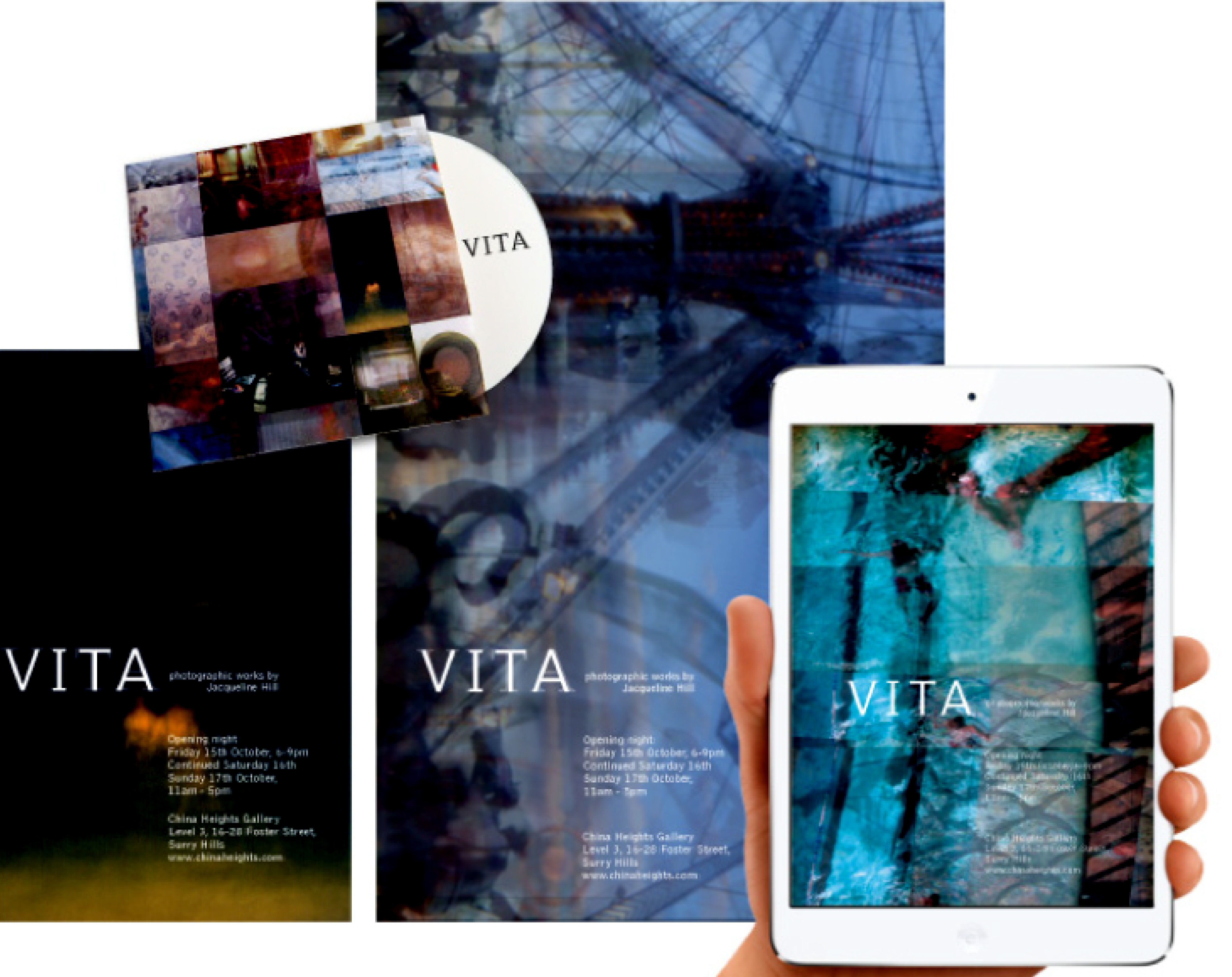
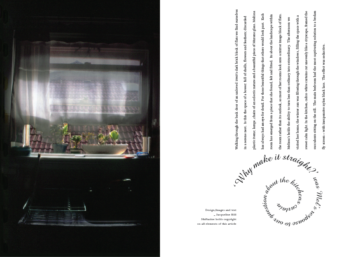
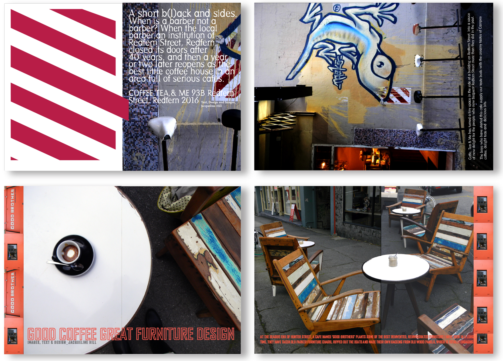
1 Design and delivery of Identity for photographic exhibition entitled ‘VITA’ at the China Heights Gallery, Sydney Australia. 2 Opening spread for article concerning inventive and cost saving interiors design ideas for Shiftazine.
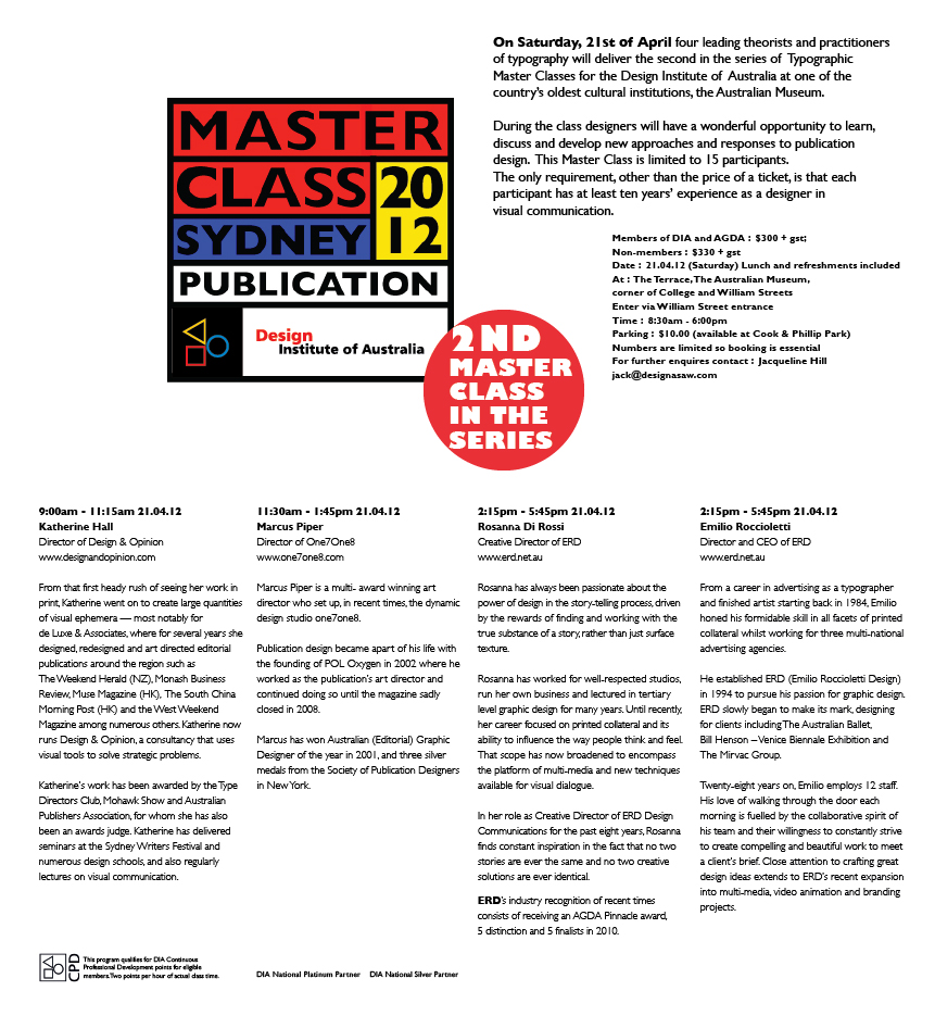
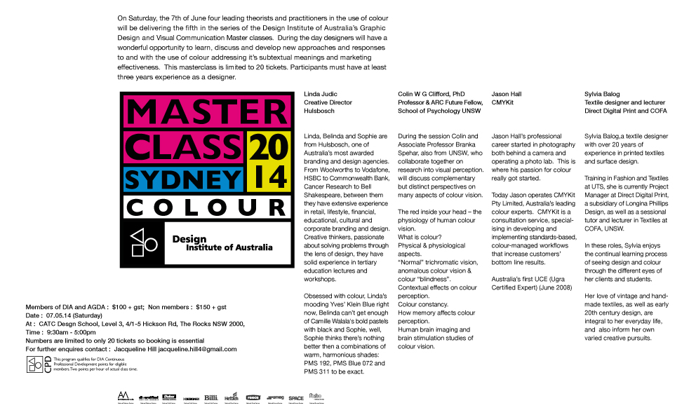
Master Class series for the Graphic Design portfolio of Design Institute of Australia council. Examples of the range of promotional material for print and on line use.
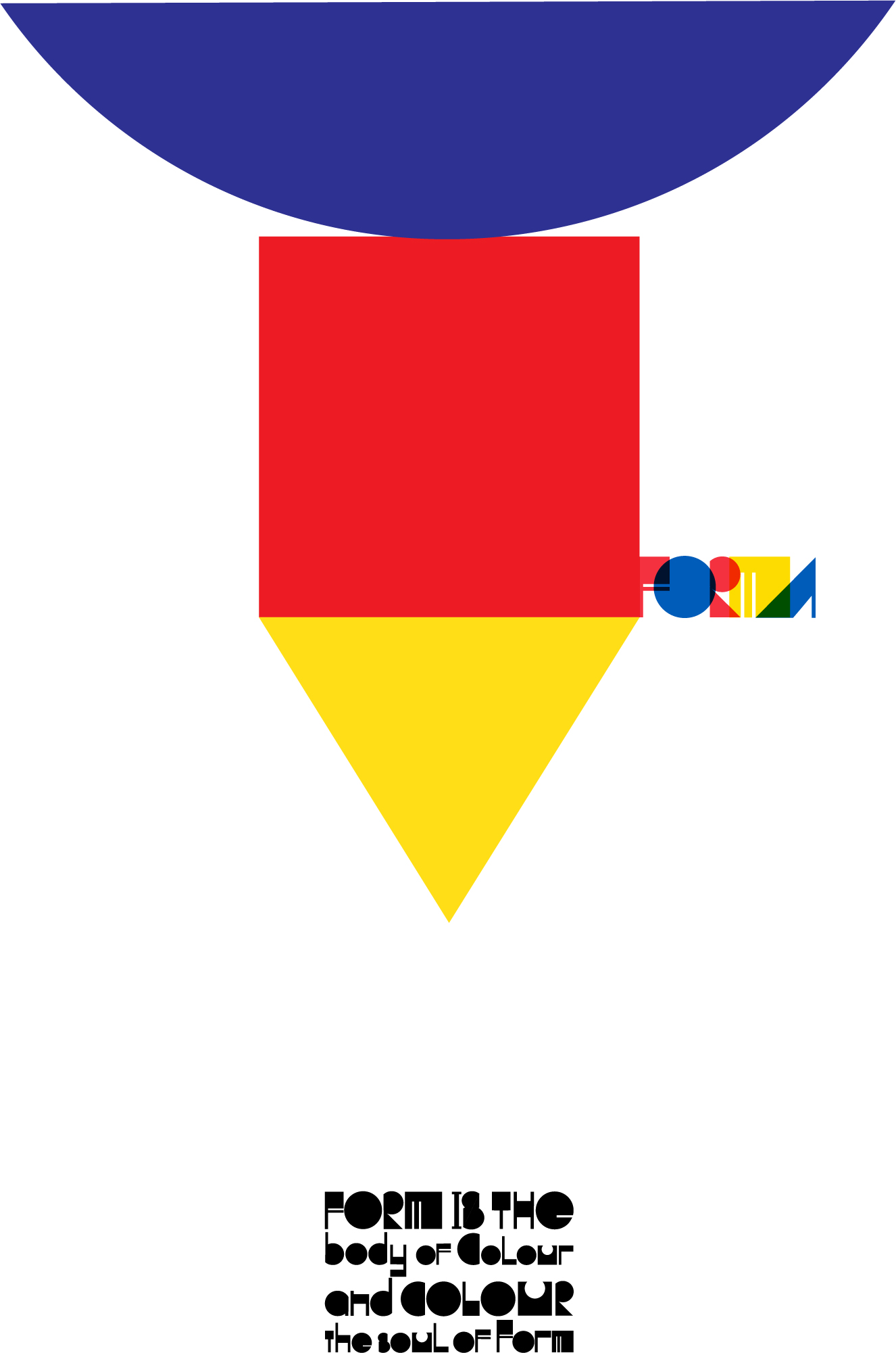
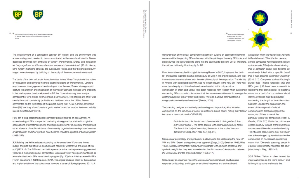
Promotional Poster for a new type face FORMA
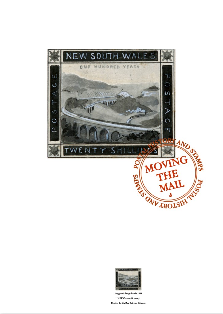
One of the designs in a poster series created for Sydney PowerHouse Museum promoting an exhibition entitled ‘Moving the Mail‘, about the history of the Australian postal services.
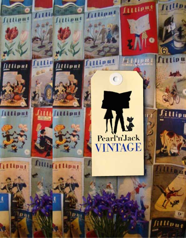
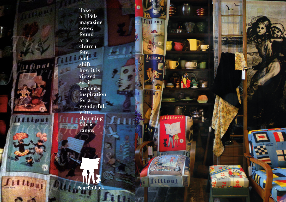
Concept and development ‘of a new product range Pearl ‘n’ Jack’, a fabric and soft furnishings range. Design brief included product development, visual identity and launch and promotional of brand via print and on line material.
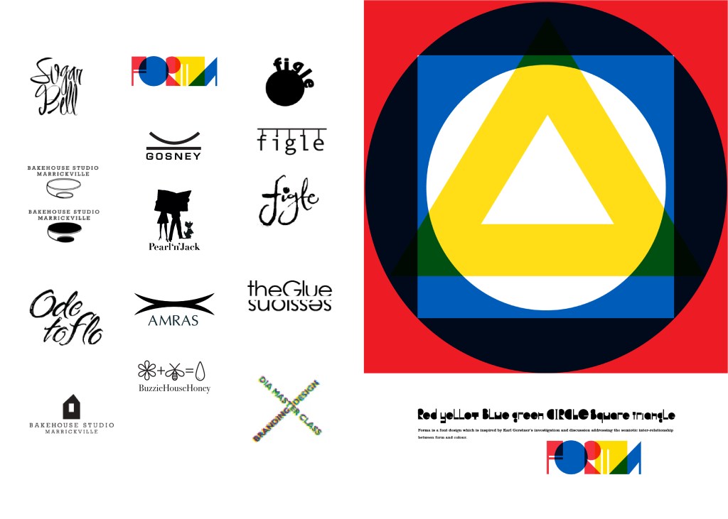


A collection of Visual Identity Marks for a range of clients, new business ventures and NGOs. (from left to right). 1 Sugar Bell. A new venture for a young pastry chef named Bella. 2 FORMA. A new type face based on Karl Gerstner’s theory on form and colour. 3 Figle. A new pickle and condiments company based on traditional Polish recipes. 4 Bakehouse Studios. An established ceramics studio and retailer based in Marrickville (concept development). 5 Gosney. Visual Identity Mark for photographer Paul Gosney . 6 Pearl ‘n’ Jack. Subbrand for Seasonal Concepts specialising in soft furnishings and textiles based on 1940s magazine imagery. 7 Ode to Flo. Title design for a short film made for a film house promotional vehicle. 8 Amras. Visual and corporate identity program for a Medical supplies company. 9 The Glue Sessions. Identity for The Glue Sessions, a design theory workshops and program for practising visual communicators. 10 Final visual identity mark (VIM) for Bakehouse Studio. 11 Visual Identity Mark (VIM) for Buzzie House Honey. Honey retailer based in inner city Sydney. 12. Identity for the Design Institute of Australia in the Graphic Design Master Class series. 2.Promotional poster design for FORMA type face.
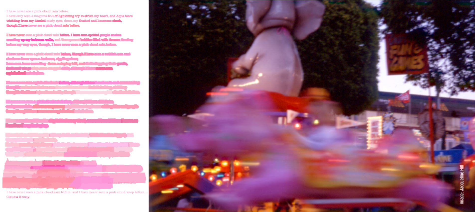
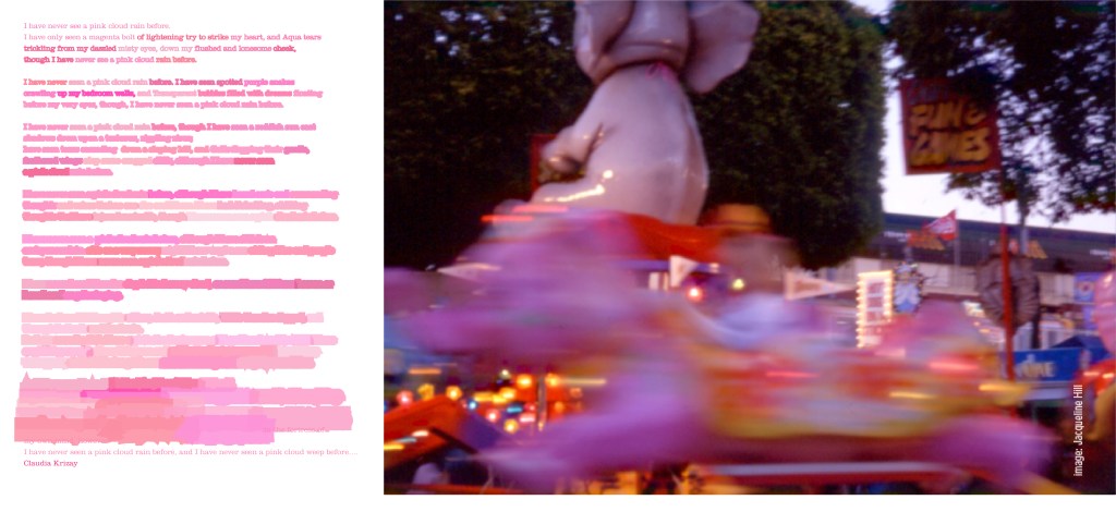
Below: 1. A wonderful poem entitled ‘I have never seen a pink cloud rain’. by Claudia Krizay. It inspired me to develop a typographic response. 2. Personal photography of the Annual Country Show held in the centre of Brisbane known as The Echa. Side show alley has always been a great source of visual fascination for me, and how can one resist a huge pink elephant whirling around and around.
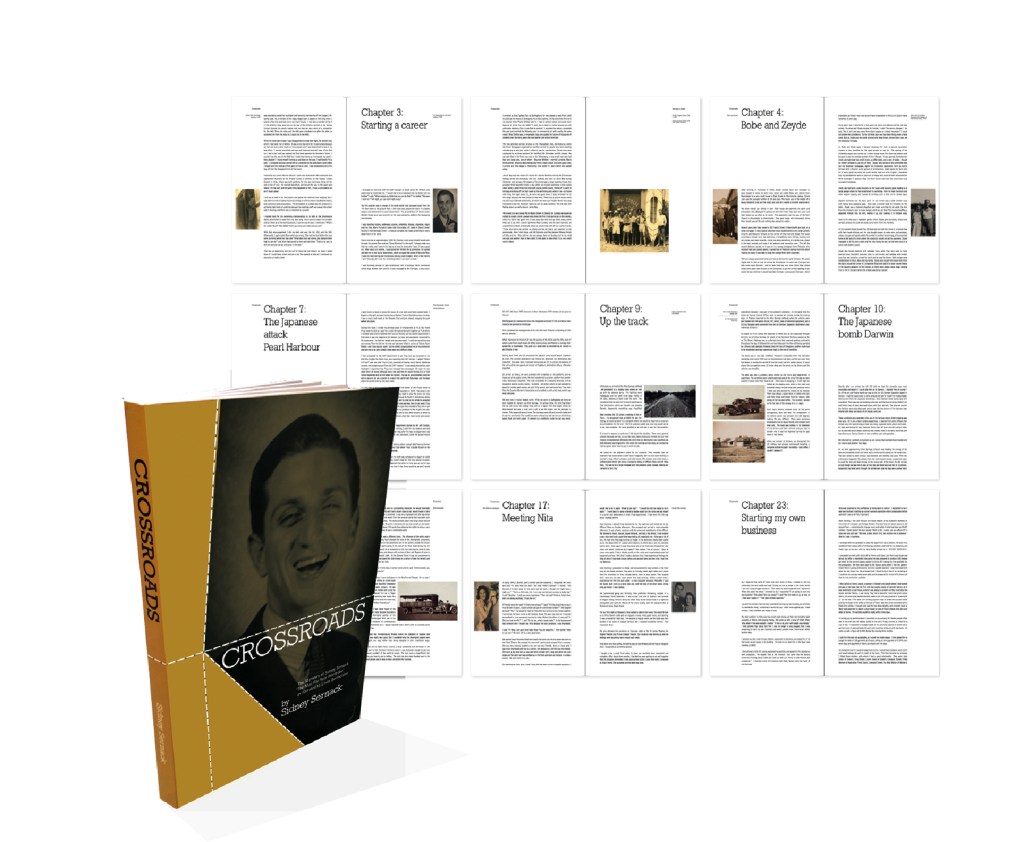
1. A biography entitled Crossroads tells the story of a self made man who started with nothing and over a quarter of a century built an Australian fashion empire which eventually would be run by himself and his children.
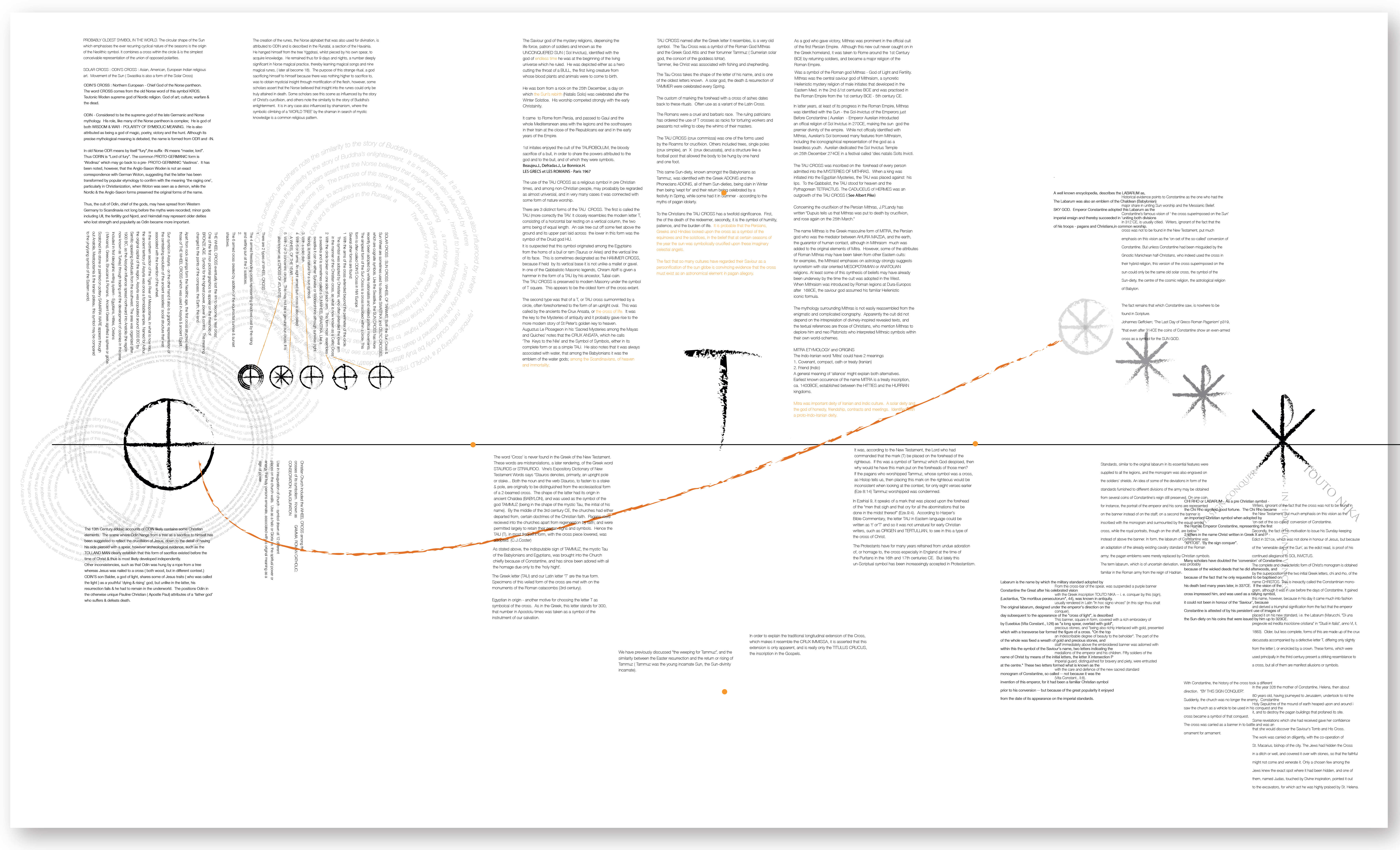
2. Typography exploration and visualisation of research conducted in relation to the historical origins of different significan graphic symbols and devices and the numinous associations found within these archetypal symbols of humanity.
1.Concept development for Freedom Furniture investigating a brand new visual language for alll visual communication related to the company which included a new Visual identity mark, all packaging, all in-store promotional material, livery and ultimately the rollout across both internal and external audiences. 2. Photography and design for cover spread of the ‘Purple’ colour book for Shiftazine. 3. Visual identity and packaging pattern for Sydney based chocolate company Genie Chocolates.
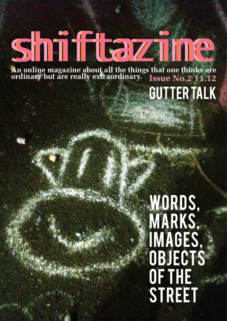
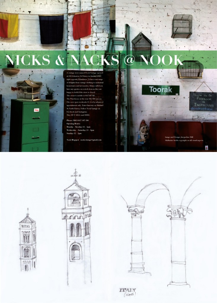

Above: 1 Cover for Shiftazine Issue No.2 ‘Gutter Talks’. Shiftazine multi paged issues were posted on-line on a regular based of about three per year. 2. Press advertisment for a vintage and tat store in Melbourne, Australia , called Nook. 3 .Personal drawings of Renaissance structures in Urbino, Italy. Below: A promotional invitation for the Design Institute of Australia textile discipline event ‘Interwoven’ both print and on line delivery.
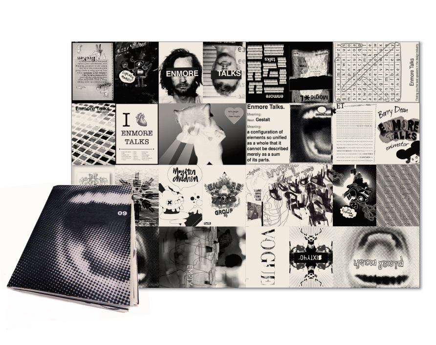
Below: Enmore Talks series was developed to assist the graduating year students of the Enmore Design Center to meet and learn from design industry leaders. The students were in charge of researching, selecting and organising a monthly event that was open to the public and the rest of the student body. The zine was a promotional piece to be circulated out into the design industry to gander interest and engagement.
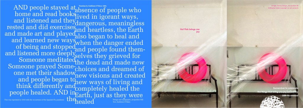
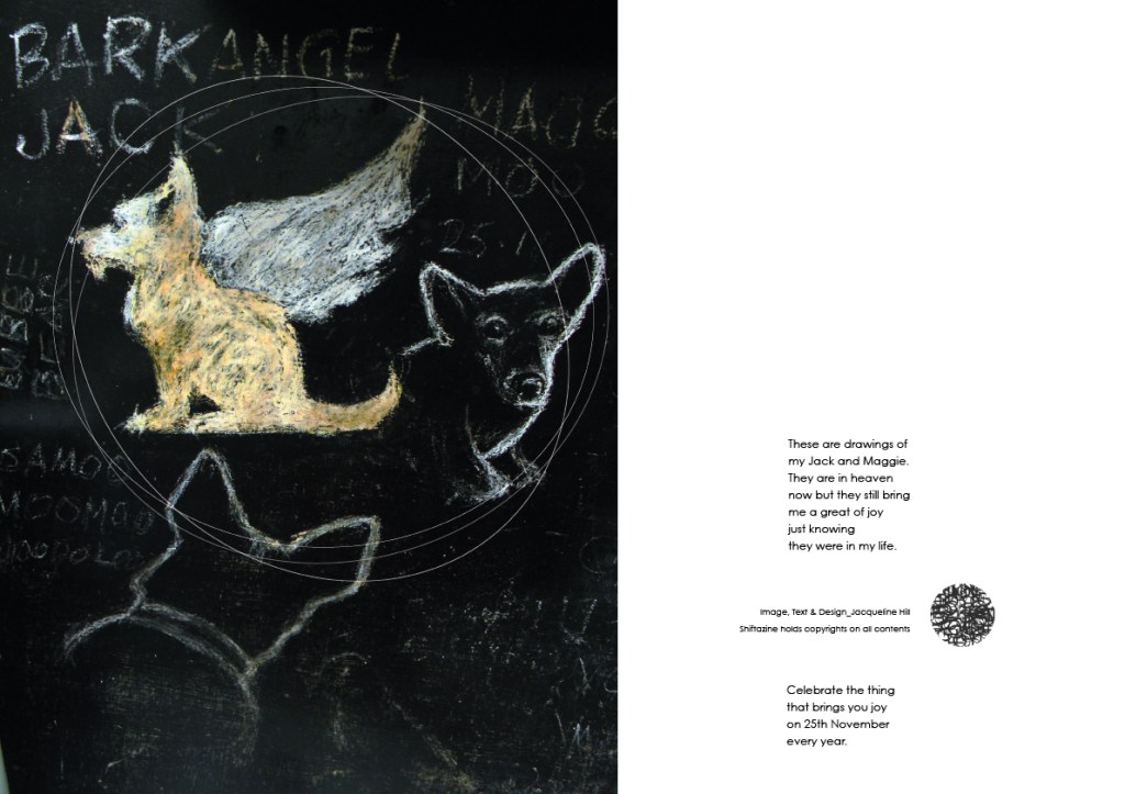
Above: I developed and launched the annual day of joy known as ‘JoyDay’, which occurred on the 25th November, every year. This DPS was one example for its promotion. 2. Freedom Furniture. 3. Opening spread for an article discussing inventive interiors design ideas for interiors design store Edite’. 4. Personal photography of observation of street details of Greek Islands. 5. An Incognition Art piece based on my Scrap Art Project ‘Things I love’ series.
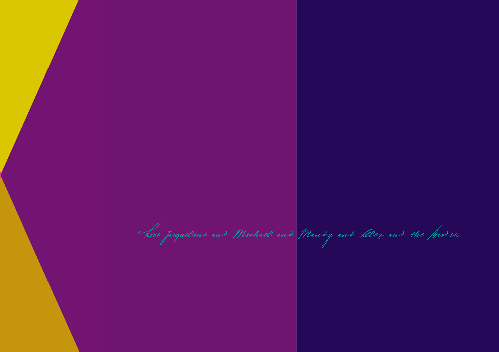
Every year I design a Christmas greeting. These greetings used to be printed and then posted to all the people I had had dealings with, either personal, friendly or professional.. Now these greetings are sent on-line. This is such an improvement in time and money out put. Colour for me is the key and the message is reflective of what ever is happened at that time in the world, either my own or the greater outside world.
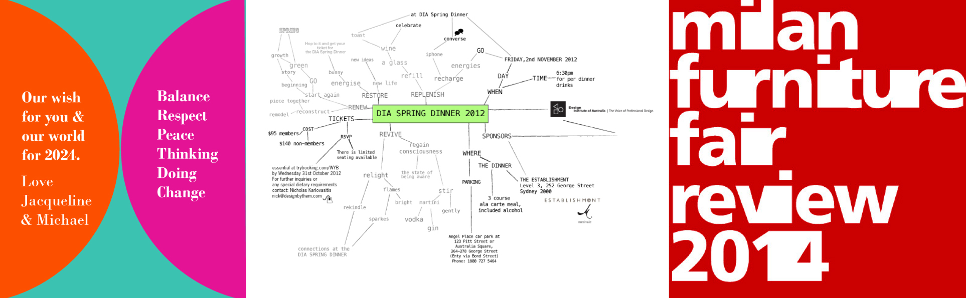
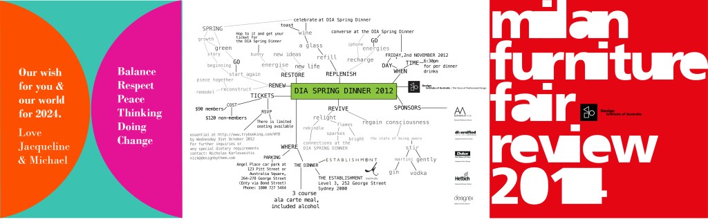
1 My annual Christmas greetings 2. An on line invitation design and collateral for the Design Institute of Australia’s annual Spring Dinner. the visual language was inspired by the process of mind mapping.3. Promotional collateral for print and on line for the Design Institute of Australia
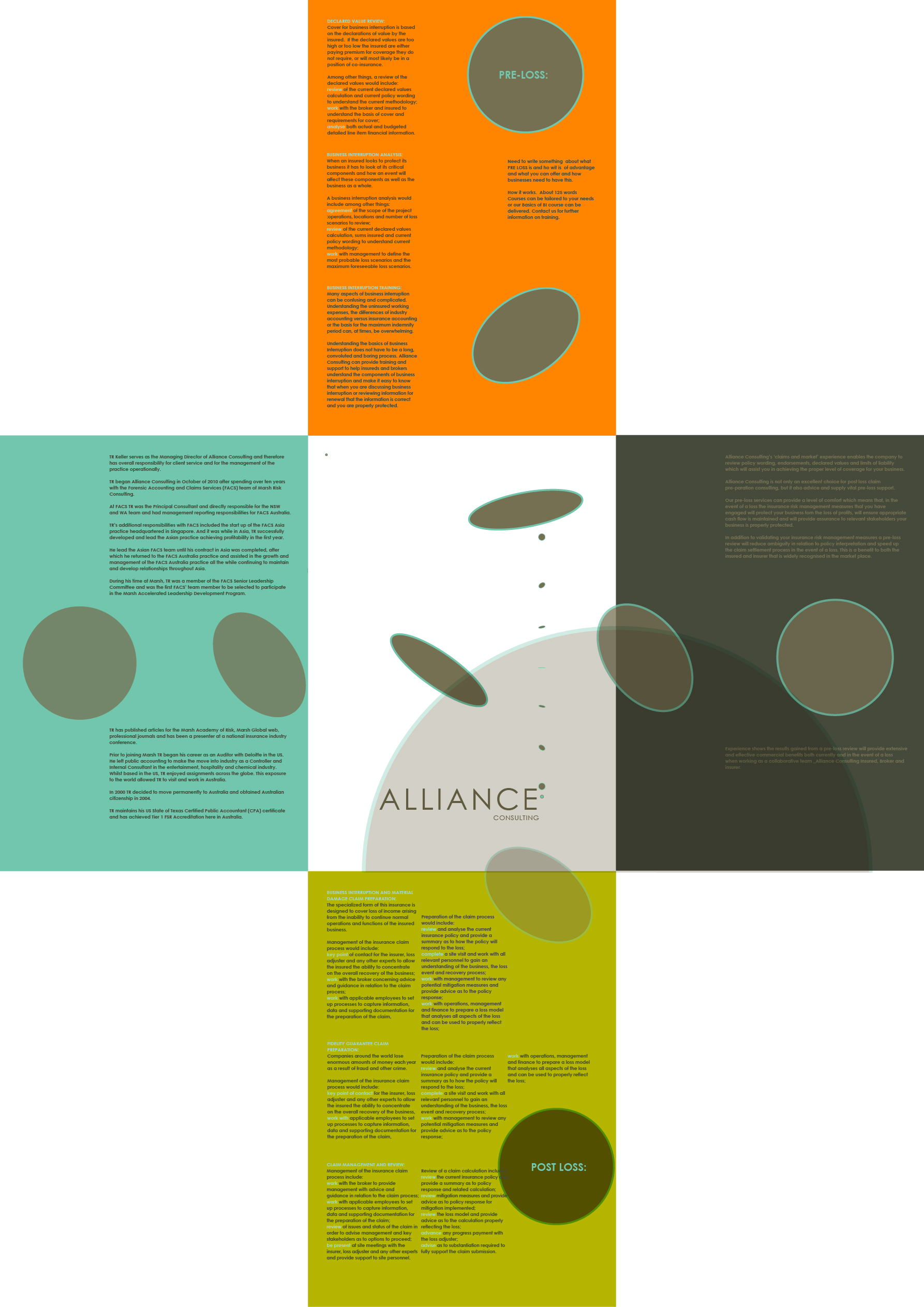
New business development with Alliance Insurance Consultancy. Concept and delivery of rollout of visual identity and relevant promotional and support print and on-line collateral.
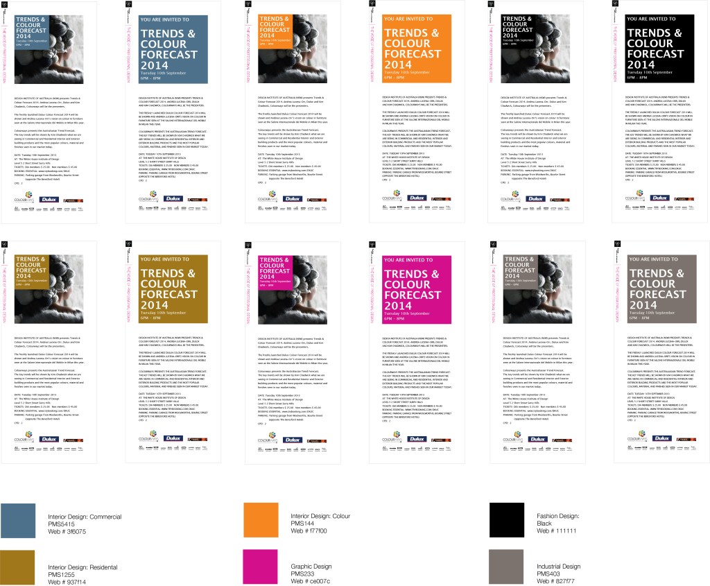
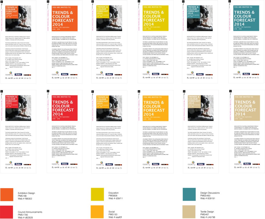
EDM design for the Design Institute of Australia. Each design discipline defined by an individual colour coding and icons. The utilisation of EDMs was a big help for managing the promotion of events and saved the DIA time and money re cutting back on postage.


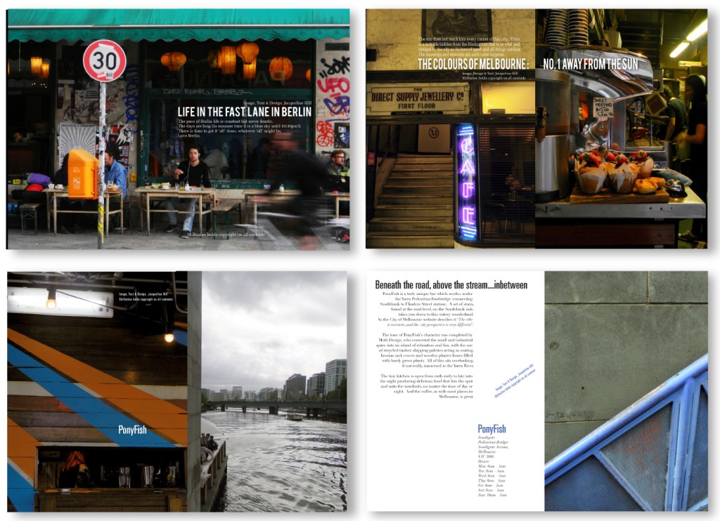
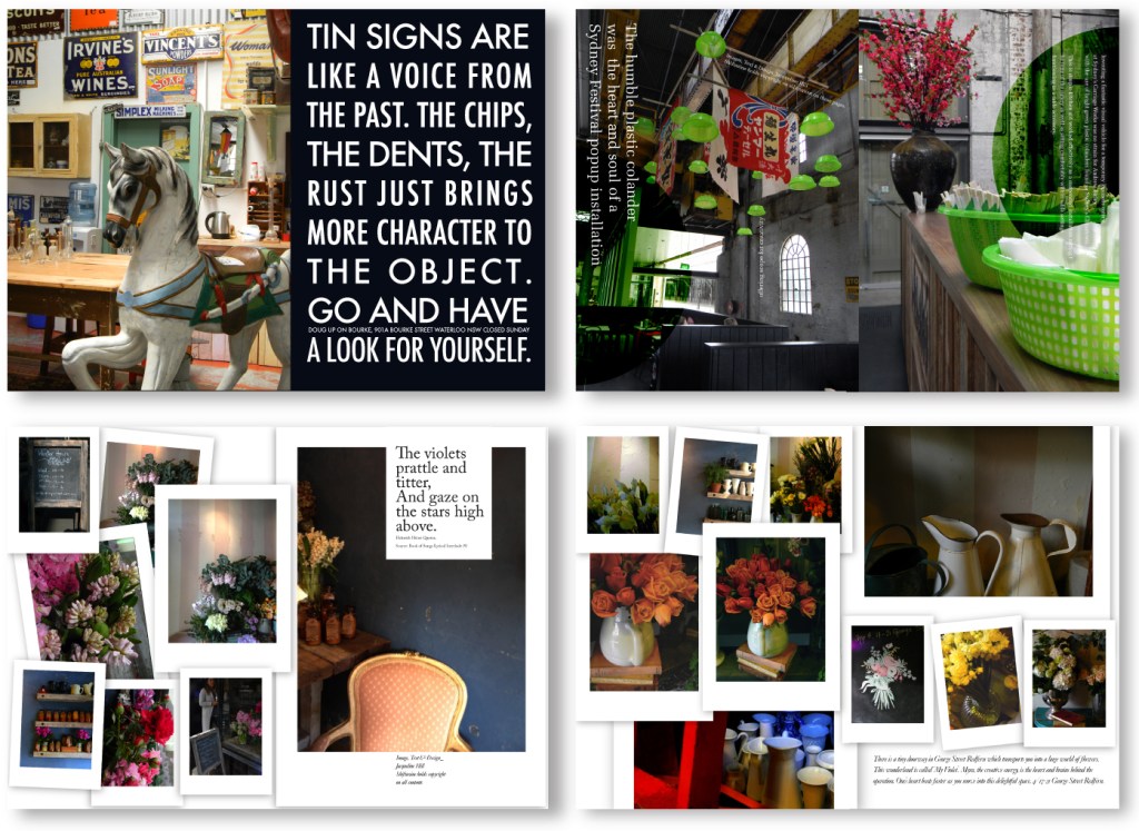
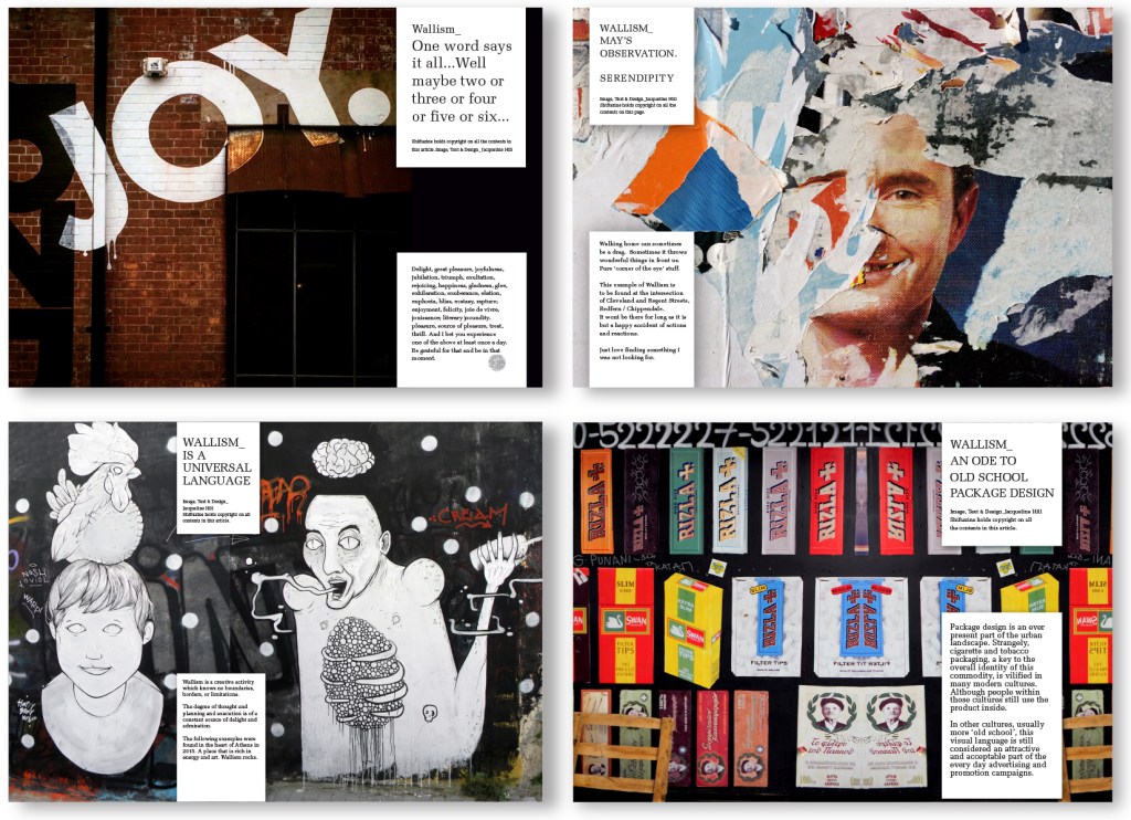
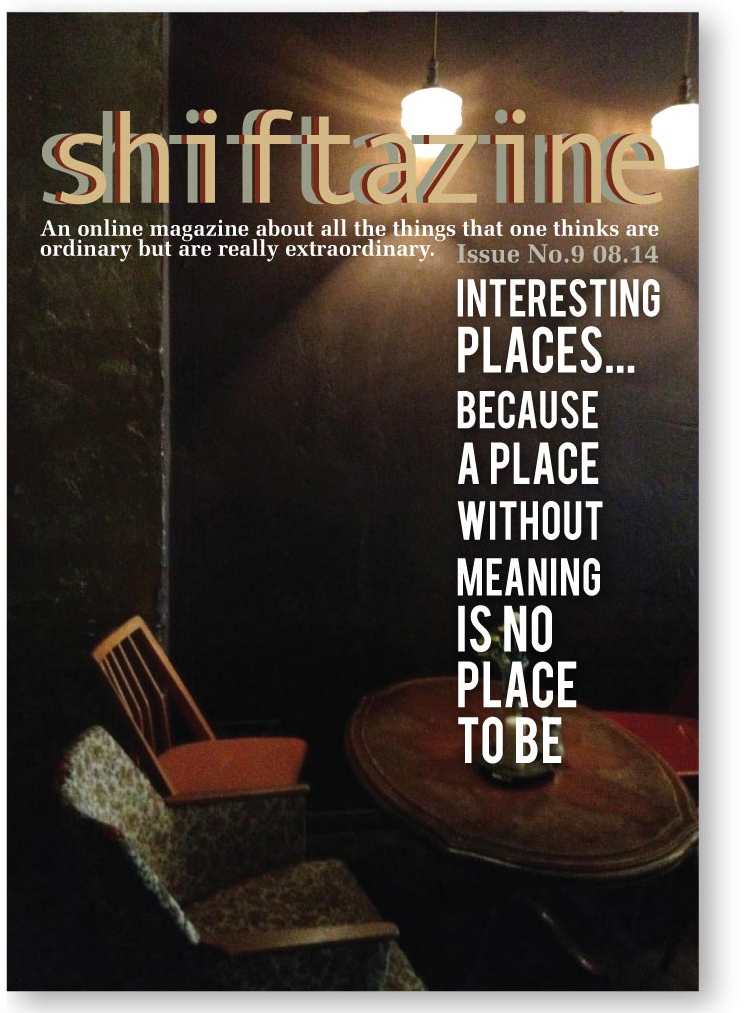
1 & 2. Cover designs for ‘Interesting Places’ Issue No.9 and ‘Wallism’ Issue No.14. 3. Two groupings of articles from two issues of Shiftazine. a ‘The Yellow Issue’ Issue No.21 and “Wallisms’ Issue No.14.